Let’s look at some of the most popular Neutral Tints and their formulas.
Most of the neutral tints on the market are analogous dyads combined with a complement, or dulling pigment. An analogous dyad means two colors close together on the color wheel (like a blue and a violet), mixed with something that will reduce their chroma (a complement or dark neutral). Some manufacturers use black as their dulling pigment, and some use a complement. The analogous dyad will tell you if the tint is cool or warm. A couple of the recipes we will see use full triads, and some use simple complementary dyads. Most of the neutrals are ‘cool’ neutrals. This means that the basic color dyad they use is in the green-to-violet range. (Most use violet, mainly because of the lack of a good range of green pigments.) Warm neutrals can be made using a warm dyad to start with – such as a red-orange.

Analagous Dyad w/ Complement

Triad

Analagous Dyad w/Dulling Pigment

Complementary Dyad
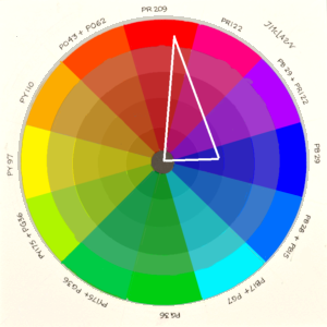
Dan Smith, Winsor/Newton, and Utrecht all use the same formula: Lamp Black (PBk6), Quinacridone Violet (PV19), and Pthalocyanine (‘Thalo’) Blue (PB15). This is a fairly transparent neutral.
Lamp black is the most common black used in paint mixtures. It has a fine grain particle and tends to mix well with everything, and is strong enough so that very little is needed. Its fine particles tend to gravitate to the edges of very wet pools. This means that in some cases you might see an edge form at the borders of a wash. This edging will be very fine, and can be quite attractive. The more water you use, the more you will see the black separate from the blue/violet pair. The Quin Violet and the Thalo Blue are both new-age synthetic organic pigments – strong, transparent and staining.

Mixing the Dan Smith version of Neutral Tint. I started with a swatch of Quin Violet, then added some Thalo Blue. The result was a little violet still, so I added more of the Blue. At this point it appeared halfway between violet and blue, so I added the Lamp Black. In order to judge the final mix better, I thinned it some.
This mix is an example of a dulled analogous dyad – two colors close together on the color wheel (Violet and Blue), dulled with black. It is a fairly easy mix to make – combine the blue and the violet until you have as neutral hue as possible, and then add a tiny bit of lamp black. This mix will also be easy to put down as a smooth wash or glaze. If you want more edging, just add a little more lamp black. Note: it is important to use LAMP black (PBk6). Substitutes like Ivory black will not produce a result that is as transparent or as easy to use. Spinel black works well, but doesn’t edge as much as the Lamp Black. Its pigment particles are heavier.
Holbein: Lamp Black (PBk6), Dioxazine Violet (PV23), and Ultramarine Blue (PB29). Again, this is a dulled, cool analogous dyad – but this mix has a granulator in it. Ultramarine blue is a sinker and tends to granulate when there is enough water and it is left to settle. Ultramarine blue is considered fairly transparent because of its tinting strength. However, the Dioxazine violet is not as transparent as the Quin violet that was used in the DS mix but has lower chroma. So, this particular neutral is not as transparent as the DS mixture, but it will be easier to mix, and has some granulation. One might say that this Neutral Tint has more ‘character’ because of the inclusion of a settling/granulating paint. The Ultramarine will make a fairly high-chroma mix, a good bit of the Lamp black will be necessary in order to reach a neutral point. The more carbon black in the mix, the duller the dried mix will be.


MGraham: Pthalo Green blue shade (PG7), and Quin Violet (PV19). This will result in a very transparent mix – even more than the Dan Smith. Note that this mix avoids black and keeps to 2 pigments – a simple complementary dyad. The fewer pigments in your neutral, the better chance you have of avoiding mud. This is a mix that is relatively more difficult to create well on your palette because the two ingredients are far apart on the color wheel.
Also notice that this mix will always be on the cool side of gray. In general, violet + green will yield a low-chroma blue.


Sennelier and Schminke: Lamp Black (PBk6), Indanthrone Blue (PB60), Quinacridone Red (PR209). Another dulled analagous dyad. Indanthrone blue is a fairly dull reddish-blue and not very transparent. The Quin Red is on the warm side with a lot of chroma, so these two mixed yields a mid-chroma violet – approximately equivalent to dioxazine violet. The mix will be slightly duller and less transparent than the Dan Smith mix. The use of Indanthrone rather than Thalo as the blue makes the mix a little easier to manage, since Indanthrone is much less chromatic than the Thalo. Indanthrone has very fine and heavy particles though, so the undercast of these neutrals will always be bluish. The Lamp black and Quin Red will both run away from the water, but the Indanthrone will sink immediately (see photo below). Also in the photo below, the left-most patch is just Indanthrone and red, and it is obvious how violet this is. Again, we are starting with a fairly bright dyad – the Quin Red and Indanthrone make moderately chromatic violet – so more black will be needed to take it to neutral.


QoR: QoR uses a ‘primary triad’: Pthalo Blue (PB 15), Quin Magenta (PR122), and Yellow Ochre (PY42). Always count on QoR to do something a little different, with a bent toward the classic. Like Holbein, QoR has avoided the black, but is using Yellow Ochre, which is a settling paint with some opacity. The addition of the earth yellow will add consistency to the mix and cause it to lean to the warm side. The colors being used are modern versions of what the 19th C artist used to make their neutrals, but QoR has substituted modern pigments with more transparency. The blue is thalo instead of Prussian, and magenta instead of red iron oxide. Again, this is difficult to mix on the palette due to the distances the pigments are separated on the color wheel and the use of 3 instead of 2. Always start with the analogous dyad – in this case mix the yellow and magenta first to get a dull, medium orange, then gradually add the complement – the blue. It is slightly easier to mix if you use Indanthrone, but the result is not as transparent. I really like this mix – the settling yellow gives it character. But be careful in using it with any other mix that contains a settler – you might end up with mud.
In the detail here you can see the granulation in the QoR mix. That is the PY42 – an earth yellow made from iron oxide. It is more obvious with greater dilution. The heavy particles of the PY42 sink and the lighter particles of the synthetic organic pigments (Magenta and blue) gravitate to the edges of the puddle of water, leaving a slight violet edge. There are many different paints made from PY42 – ranging in color from moderately bright yellows to low-chroma reds and browns. The one I chose to use was “Italian Deep Ochre” from Dan Smith. It is a very dull, yellowish brown. I chose it because it was one of the lowest chroma PY42’s I had. The lower the chroma of the ingredients, the easier it will be to get gray.


Primary Triad

Granulation Detail
Old Holland: Pthalo Blue, Quin Violet, Ultramarine Pink (PR259) and Burnt Umber. The Burnt Umber is the neutralizer in this mix, but it reduces the transparency. More than 3 pigments should never be necessary for making a good neutral, and two is best. With modern pigments, there are MANY 2-color mixes that can produce nice neutrals. This is a dulled analogous triad. This is by far the most dangerous of the neutrals listed here in terms of producing mud. I would refer to this mix as a ‘gray’ rather than a ‘neutral tint’.
Rembrandt: Lamp Black and Quin Violet. Simple. Rather than use a dyad to make their violet, they START with a single-pigment violet. Obviously this is a violet gray, so should be used where you want to both cool and neutralize.
Schmincke also offers a ‘Neutral Gray’, which is Indanthrone blue, Pyrrol Scarlet (PR255), and Benzimida Orange (PO62). This is a very interesting mix. At home you will have trouble getting this to neutral, but the mix will produce interesting results – and definitely will affect characteristics other than chroma. Note that this mix is a complemented analogous dyad : the analogous dyad is the warm couple of scarlet and orange, and the complement is the Indanthrone. The gray is extremely neutral, in my opinion, and definitely a warm gray. This mix is a variety of a popular classic gray combination: Ultramarine and Burnt Sienna. Notice it is labeled as a ‘gray’. The term ‘gray’ indicates that the mix has more characteristics than a typical neutral tint. I would hesitate using it to tone down paint, but it is very interesting used on its own. The Benza Orange will invite backwashes and blooms that will reveal the staining blue underneath. There are many other examples of these kinds of neutral mixes that are quite fun to play with. A couple of my favorites are ‘Shadow Violet’ and ‘Moonglow’ by Daniel Smith.
The photo shows the mix progression for this gray. I started with a mid-point mix between the Orange and the Scarlet (left most), and gradually added the complement (blue) until I reached a gray I was satisfied with. Then in the bottom example, I have introduced some water so that we could see how the pigments react. Both the benza orange and the pyrrol scarlet are new age paints with fine particles, so they tend to move more easily with the flow of water, leaving the slightly heavier Indanthrone particles to stain the paper. (Notice that some of the scarlet has even run up into the water, leaving a slightly pink haze.)

In Part 4, I will introduce some grays that are really nice, but not on the market, and I will give you a formula for making ‘magic grays’.