Grays with ‘Character’
This section is not about neutral tints at all, but an approach to mixing grays with character.
I’m sure at some point every watercolorist has mixed up a batch of paint thinking it will be a nice color only to end up with a very muddy-looking result. This can happen when you get too many different pigments into the mix, or when too many of them are opaque and/or settling. Once your mix has lost its chroma (intensity) it seems like it’s a lost cause. This technique I’m about to show you changes that. This phenomenon of color separation is something that only watercolor can do because watercolor pigments are not bound together in the medium and, given enough water, will separate on the paper to produce what I call a ‘vibrating gray’.
I always say “Embrace the Mud” – at least the mud that is created in the correct way. In order to make mud work for you, it needs to have a settling pigment and a floating pigment. I’ve found it is best if the settling component is a single pigment. The floating component can be a mix, as long as the mix is all floaters.
If you don’t know which of your paints are sinkers and which are floaters, take a quick read here.
Ready to mix
Now that you have sorted your sinkers from your floaters, just pick any of the sinkers and mix with any of the floaters. Again, try to use just one sinker – you will eventually get a feel for it and learn that some sinkers will work well together. (For example, Ultramarine Blue and Viridian combine well.) Choose a floater that you feel complements the sinker in terms of color – it could be an actual complement, or it could be a neutralizer. Mix the two until you have a very grayish or brownish, low-chroma (dull) mix.Plenty of Water!
The trick to making a mix like this work well is to use plenty of water. The water doesn’t have to be in the mix to start with, it can be added after the paint is on the paper, or the mix can be dropped onto very wet paper. The floating pigment will move around readily in the water – ‘go with the flow’, while the sinker will tend to stay where it was applied. What was mud now becomes the two colors again, setting up a vibrancy. Be sure to give the sinker time to sink to the paper before you agitate the paint. Use gravity to influence where the floater ends up, but don’t agitate too much and Definitely avoid brushing! Be PATIENT. Once the paint starts to dry (a point when the water no longer moves around when you tilt the board – the paint will start to dull), you can add more water to further force the floater to the edges.Some Magic Grays
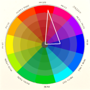
Daniel Smith has a couple of grays that are magic. They both illustrate the type of formula I am suggesting. In both, they use Ultramarine Blue + Viridian as their ‘sinker’. In “Moonglow”, they use Anthraquinone Red (PR 177) as the ‘floater’, which is a dull medium red, edges nicely, and it’s not overpowering. Since it’s low-chroma, it works as a dulling complement very well. PR 177 is not real lightfast, but there are so many pigments in this area of the color wheel, it’s safer to mix it yourself. In “Shadow Violet”, Pyrrol Orange is the floater, which results in a warmer gray. Both paints have good color separation if you use plenty of water.Dos and Don’ts on making your own amazing grays
- Use plenty of water. Apply the paint very thin, or drop thicker paint onto wet paper. You can always add more paint to an area. I suggest having a syringe with a very fine tip for lifting excess water. This is a good way to lift the floater without disturbing the sinker.
- Avoid putting the paint down with a brush stroke, UNLESS you want the stroke to show. Your sinkers will hit the paper and stay, making it obvious where your brush has been. The floaters can still be moved with water. A firm stroke into wet/moist paper will have nice results. Never brush back over a settling paint that’s on the paper.
- Mix thoroughly before each application, some sinkers sink very fast
- Most importantly – be PATIENT. Disturbing the paint too much while it is drying will nullify some nice results, such as granulation. Find something to distract you for several minutes, and then check back. It is very tempting to try and correct/change wet watercolor. The most pronounced effects you can create happen at the point in drying when the paint begins to lose its gloss. I call this the ‘flash point’. At this point in the drying stage, the sinkers have found their home, but the floaters can still be coaxed to the edges. Dropping in water or more paint will lift the floater and, like a miniature tidal wave, will push those pigment particles away. This creates even more separation of colors. Do not touch the paper, unless you want the sinkers to be disturbed. Use the brush as an eyedropper (or use an eyedropper).
- The mix doesn’t always have to add up to gray. Gray is just how we got to this point in this blog. Achromatic mixes do very well with this approach too. For example, a violet made with Ultramarine Blue and Quinacridone Rose is an excellent example.