Why use a Limited Palette?

- You learn about mixing pigments in general because you’re forced to do more mixing. When you use a complex palette, you spend more time choosing a paint than you do mixing.
- You learn more about the particular pigments you are using. It’s easier to learn about pigment interactions when you have fewer pigments in your palette.
- You insure your painting will remain color coordinated.
- Helps to guarantee your painting remains in the area of the color wheel you want it.
- It’s a great way to experiment with a new pigment. If you have a favorite palette combination and get a new paint, substitute it in for one of your regulars.
- It’s a way to force you out of your comfort zone. You may not be able to mix a particular color, so you have to settle for something that doesn’t exactly match what your source shows you. In many ways, a palette defines an artist’s style.
- Learn how to make the eye ‘see’ colors that are not there – the ‘magic’ of pigments.
What is ‘Color’?
In order to communicate succinctly when referring to a color, it is best to describe a color’s characteristics. Through the decades there have been numerous definitions related to what defines a color. Let’s look at the most accepted of these.
Modern color analyses follow a 3-dimensional model.
The three dimensions represent three characteristics of color.
Three Characteristics of Color
- Hue. This is typically what we refer to as the ‘color’ of something.
- Saturation. This parameter addresses the intensity of a color – like a bright red versus a dull red. In general it represents how pure a color is versus how much gray it contains. Pigments are fine particles of solid material that reflect light. If they reflect only the light in a narrow band and absorb all other colors, then they are more ‘pure’ – or higher saturation. For example, a bright red is more chromatic than a dull red like red ochre.
Other terms used for saturation include ‘chroma’, and ‘intensity’. - Value. This simply represents how dark/or light the color is.
How are color characteristics represented?
The models commonly used to represent color are 3-dimensional (since there are 3 parameters). Three dimensional models are either Cartesian or Polar. The models most often used to represent colors are of the Polar variety.
Polar models are like spheres. Think of a globe. Hue is represented as longitude – an angle from 0 to 360 degrees as we move around the globes equator. Chroma is represented as a distance from the center of the globe – the brightest colors will be on the outer surface of the globe. Value is represented as the line between the poles, with the North pole being white and the South pole being black.
Let’s look at each of the characteristics (the three dimensions of color)

HUE ANGLE
We are looking at the globe from above at a slice through the equator. The angles around the equator represent the range of colors. The selection of 0 degrees to represent red is arbitrary, and some models differ in this respect. From this model we can indicate any color by its angle. For example a middle yellow is called 90 degrees, etc.
HUE ANGLE SAMPLE
This table is an excerpt from a larger table that lists all pigments. The pigment here is PO62 (all pigments have alphanumeric indicators like this. For more information on this, refer to What’s in Your Paint.) Chemically, this pigment is a ‘Benzimida’ formula.

In this table we are seeing the paint made from the PO62 pigment by several different manufacturers. Each manufacturer has its own name, for example Dan Smith refers to their version as ‘Permanent Orange’, etc. What we want to note specifically from this table is the column on the far right. It represents the HUE ANGLE of their version of the paint. Hue angles are measured with a spectrophotometer. The Dan Smith paint has a hue angle of 50, while MaimeriBlu’s has an angle of 58. Take a look at the Hue Angle diagram. The hue angle of 50 is closer to red, and the 58 will be closer to yellow. In summary, if you’re looking for a more reddish orange, the Dan Smith version would be more to your liking.

SATURATION (Chroma, Intensity)
Again, imagine you are looking down on the globe from above. The Chroma is a measure of how far from the center the particular color is. In this illustration, we are looking at a yellow-orange. At the outer edge, the orange is intense (high chroma). As the line goes toward the center it gradually gets grayer and becomes totally neutral at the center. Did you ever wonder why there are no browns on the color wheel? A brown is merely a low-chroma orange, red or yellow. When we had chroma to our model, our color wheel now has spokes (or radii). All the colors on one ‘spoke’ of the wheel like this are called ‘shades’.

VALUE
THREE-DIMENSIONAL MODEL
At this point we are looking at the full ‘globe’. The ‘value’ is measured from North Pole to South Pole, with North being white and South is black. In this figure we have all three of the parameters shown: Hue going around equator, Saturation (Chroma) as spokes out from the middle, and Value as the north/south poles.
Note that the Values as shown as 1 to 10. This is typical of a Value Chart (below).


MUNSEL 3-D COLOR MODEL
Here we see more accurately where the different colors are found in the color model. When represented in 3-d it is typically referred to as a ‘color tree’. Upon close inspection, we see that colors are positioned as we would expect. For example, the yellows are further north, because they are lighter. No matter how strongly you mix your yellow, it will never become as dark as a blue or a violet. Also, yellows are more intense- so they extend further from the center. If this diagram confuses you, skip it for now. It will make more sense with time.
The yellows stick extend out much further than the blues, greens and violets. The yellows and oranges and some reds are much more intense (higher chroma) than the cool colors. This is due in part to the way our eyes perceive color. When drawing your mixing lines its important to keep this in mind when mixing with a yellow or orange.
Let’s find out how we can utilize the color tree.

HUE-CHROMA MODEL showing MIXING LINES
A very important visualization tool provided by a color model is what we call ‘mixing lines’. For this lesson we just need a 2-d version of the color model with the Hue and Chroma parameters.
Again, we are looking down from the north pole. The Hue is indicated as the angle around the circle and the chroma as the distance from the center.
In this particular example, we are looking at four different mixes:
- Green mixed with Magenta,
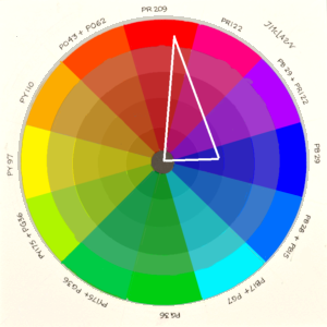
- Red (PR209) mixed with gray,
- Orange mixed with Magenta, and
- Yellow mixed with Magenta.
All four mixes produce the same color (Hue), indicated by the squares labeled ‘mixing point’, each with different saturations.
A Mixing Line is a line drawn on the color wheel between the two colors you are mixing. Any color along the line can be mixed by varying the ratio of the two paints. For example, to reach the mixing point shown we need more magenta than yellow, and more red than gray, etc.
QUESTION: Can you see how you could reach the same mixing point using a blue and orange?

PALETTE ‘GAMUT’ using MIXING LINES
In this diagram we have built a palette with 6 fairly chromatic paints. Then we connected these colors with mixing lines to create a space in the middle. The area within the polygon is called the Color Gamut for that particular palette. A color ‘gamut’ shows all the possible colors you can mix. Everything within the polygon is mixable; anything outside is not mixable with this palette.
It’s important to show the pigments on the wheel in their actual position in order for the mixing lines to be accurate. That brings us to an actual pigment color wheel. or Pigment Chart.
THE PIGMENT CHART
- Color wheels use ‘ideal’ colors. They assume that every color is possible.
- We work with Pigments, not colors, so we need a wheel that shows exactly which pigments are available and where they fall on the color wheel.
- Most pigment manufacturers have Color Charts or Pigment Charts. You can use any one – all manufacturers have essentially the same pigments
- These work for any wet medium. All artist media are made from the same pigments. The only thing that changes is the vehicle (and the names).


Daniel Smith Pigment Chart
This ends part one of this lesson. Part 2 will look at the process of selecting a palette, utilizing the Pigment Chart.