Whenever you want to mix any color, the easiest path will always be to mix two colors which are close to the color you desire. As a simple example, consider mixing a violet. You would choose a red that had a bluish component (like a rose or magenta), and a blue that leans red – such as ultramarine blue. Carrying this argument forward; to mix a neutral more easily, start with pigments that are already close to neutral (center of the color wheel). Grays can certainly be mixed using high-chroma paints, but it will be more difficult.
Approaching from that point of view, I will list some of the more common low-chroma pigments that can be easily used as a neutralizer . There is quite a variety here, so you should be able to find some of these in your palette. Many of the same pigments have different paint names. Look on the tube for pigment ID’s. [I will often refer to a paint’s ‘Pigment Identifier’ or ‘CI’. If you’re not familiar with this, you might want to take a quick review of the guide to knowing What’s in your Paint.]
Blacks
Do not eliminate blacks just because they have a bad reputation. The classic blacks (made from soot) have some nice properties, and as long as your not using them too strongly, will be just fine. Lamp Black (PBk 6) is used in many neutrals, grays and other low-chroma colors, so why shouldn’t you use it? Often you will see a watercolor artist claim that s/he would never use black, yet they might have a paint in their palette like ‘Indigo’, which is merely a convenience mix of blue and black. Of the classic blacks, Lamp Black seems to be the best choice for reducing the chroma of some bright paint. Ivory Black (PBk 9) is slightly warmer than Lamp. Other carbon blacks include Furnace Black (PBK 7, from coal), and Charcoal Black (PBk 8, from wood). It is best to think of these carbon blacks as ‘grays’; if they are used to achieve a dark value, the result will be dull. Better to use a strong blue, like ultramarine.
There are some non-carbon blacks, notably: Spinel Black (PBk 26) – This is the black to keep on your palette. Spinel is a semi-precious gemstone, but the pigment is made in the lab. Perylene Black (PBk 31), which is more of a green than a black, as mentioned earlier is a great neutralizing pigment – can be used to tone down any color. A fun black choice is a ‘Magnetic Black” (PBk11). It is an iron-based black rather than carbon, and it is extremely granulating. Use this with plenty of water and watch the pigment particles respond to a magnet!
[At the time of this writing only a couple paint manufacturers offer a Spinel Black. Mairimblu has a ‘Neutral Tint’ which is really just Spinel Black and Rembrandt’s version is called Spinel Gray. Daniel Smith offers the Magnetic Black as “Lunar Black”.]
Classic Brown Neutralizers
Any of the browns are born neutralizers. Browns are just low-chroma yellows, oranges and reds. So, when you’re looking for a complement to them, be sure to keep that in mind. There are classic browns and modern browns. The primary difference is that modern browns are typically floaters, while the classic browns are heavier, sinking pigments.
The classic browns have been in use for centuries. Traditional names include words like ochre, burnt, raw, sienna, umber, Mars, etc. They are all iron oxides of a type. Though they all have the same Pigment ID code, the pigments can vary considerably across pigment manufacturers. In addition, the pigments are very easily manipulated by paint manufacturers to bring out specific characteristics, such as opacity and granulation. Next time you have one of these mixed, smell it closely; you will smell rust – iron oxide. The two classic pigments most used (by far) are PR 101/102 and PBr7. These two pigments are responsible for literally 100’s of watercolor paints on the market. [PR 101 and 102 are the same pigment; 101 is made in the lab, and 102 has a natural origin.] The colors can be made to range from a dull yellow all the way to a deep reddish violet. The paints made from these pigments are typically called opaque, to semi-opaque, but do not let that discourage you – most of them thin to gorgeous, quite transparent washes. These pigments have been in use as neutralizers for several centuries, and are still a favorite among all painters. They can be used to tone down any bright paint, and work especially well with blues and greens.
Here are four examples of paints made with PBr 7. You can see the variation in colors available.
From top to bottom:
Burnt Umber from M.Graham
Raw Umber, Sennelier
Raw Sienna, M.Graham
Burnt Sienna, Holbein

These are all swatches made with different versions of PR 101/102. As you can see, colors can vary from a orangish yellow all the way to a reddish violet.
From top to bottom: “Red Sartorius Earth” by Rublev, “English Red Earth” by Dan Smith, “Venetian Red” by Old Holland, and “English Red Ochre” by Dan Smith

Modern Brown Neutralizers
Most modern browns are synthetic organics. Simply put, it means made in the factory and based on a carbon atom (organic). There are quite a few of these, but I will just mention some of the most used. PO 48 (Quinacridone Orange), PR 206 (Quinacridone Maroon) and Perylene Maroon (PR 179) are a few of the most popular and can be mixed to match any color in the classic brown category. The big difference is that these modern pigments are finer and lighter than their classic counterparts and tend to flow out evenly in a wash – they are floaters. Try mixing these with blues, greens, and violets that are sinkers for a separating gray.
Green, Violet, and Blue Neutralizers
Dioxazine Violet (PV 23 or PV 37) and Indanthrone Blue (PB 60) are both modern, fairly transparent, low-chroma neutralizers. Try either with a strong, transparent green (Phthalos). And try with any oranges or earths. They both have many aliases, so check your tubes for pigment info.
Perylene Green (PBk 31) and Perylene Violet (PV 29). These two are both wonderful low-chroma neutralizers used alone, or make a very well-behaved cool gray when combined. [Note that the green actually has a black pigment code.] It’s very possible that you do not own either of these paints. The Perylenes are a class to themselves in terms of how well they behave, especially when very wet. The perylenes colors vary from a deep scarlet, to a very low-chroma violet. A good one to start with is Perylene Maroon (PR 179). A very nice low-chroma maroon that can compliment just about any paint. Many watercolor artists make their transparent neutral from Perylene Green and Perylene Maroon, but I prefer the Violet.
Mixing a Neutral with High-Chroma Pigments
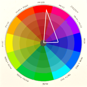
So far I have only listed low-chroma pigments. Neutrals can also be mixed with high-chroma pigments, its just a little more difficult. A violet and green mix is a common recipe for modern neutral tints. Quinacridone Violet (PV 19) and Phthalo Green, either shade (PG 36 or PG 7). These are two fairly high-chroma pigments, yet make a good, extremely powerful, extremely transparent neutral. Since they are so far apart on the color wheel, mixing to the perfect neutral is a bit harder. Go slow, and as you look at the mix, ask yourself – “does it look more Green, or more Violet?” Whichever the answer, add more of the opposite. When you get to the point where you can’t say either, you are there.
This set of test strips illustrates a couple of points:
Watercolor palettes may contain 2 or 3 colors that are the same, but have different characteristics. In this particular case I am looking at three blue-greens, all of which have approximately the same hue: Thalo Green, blue shade (PG 7), Viridian Green (PG 18), and Amazonite (From Dan Smith, this pigment is made from ground Amazonite stone which has not been assigned a CI.)
A gray can be mixed with a green and a violet. For these mixes I have used Perylene Violet (PV 29) with each of the 3 greens.
Note a couple of things. 1) Viridian is a heavy granulator, therefore it produces a granulating gray where we can see the violet separating from the green. 2) The mixture with Thalo Green stays well mixed.

In the next post of this series we will look at some of the commercial ‘neutral tint’ mixes available from the top watercolor purveyors.