Characteristics normally associated with watercolor paints include transparency, staining, granulation, light-fastness, value range, blossoming, etc. In this article I want to talk about the physical characteristics of pigments in order to further understand what some of these terms actually mean.
Whenever the subject of watercolor arises there always seems to be some discussion that turns to ‘transparency’, and how watercolors are unique because of their transparent nature. To amplify this, watercolor paint manufacturers rate the transparency of each of their paints, usually on a scale of 1-5.
Interesting sidenote: What watercolorists refer to as “transparency” industry professionals use an opposite term: “HIDING POWER”. If you’re painting your living room walls you want a paint that will require the least number of coats.
Let’s talk about what transparency means in terms of watercolor. First off, no pigment (the ingredient in paint that provides the color) allows light to pass through it. The main goal of a pigment particle is to reflect light of the proper wavelength and absorb the rest. So, if it actually was letting light pass through it, it would not be doing its best job.
Imagine pigments as tiny particles of crushed gems (some actually are). Now imagine that you scatter some of this dust sparsely over a white surface. There will be space between the particles. Through this SPACE you will see the white surface. This is what ‘transparency’ means in terms of watercolor. Being able to see some of the paper means there is some transparency. Thickly mixed paint can completely cover the surface of the paper. Any paint is capable of doing this if mixed strongly enough. Any watercolor paint, no matter how opaque it is said to be, can be diluted enough so that it is transparent. An excellent example of this is Indian Red. This paint is often referred to as ‘house paint’ because of its widespread usage in architecture. It is the same as the original barn paint – known for how well it covers, seals and protects. Even at moderate strength, Indian Red will completely cover the paper. However, when diluted enough, it becomes a lovely, VERY transparent dull pink.
So, how does this information impact the watercolor artist? Which paints are ‘transparent’ then?
Pigment particles have three important physical characteristics for this discussion: SIZE, DENSITY, and STRENGTH. Let’s see how each of these physical characteristics come into play.
Particle STRENGTH
Strength refers to how much of the light of the desired color gets reflected. For example, when white light strikes a green pigment particle, the particle should absorb all non-green wavelengths, and reflect only the green wavelengths. The better the particle does this, the stronger (or more chromatic) it is. The illusion of transparency actually comes from strength. Think again about those particles you scattered on the white surface. Up close (it takes a microscope) you might see individual particles, but if you back up far enough, your eyes only see a blend of the white surface and the color that is reflected by the particle. For example, if your pigment particles are RED, and you scatter them thinly over a white surface and back up far enough, you will see PINK (white of the paper plus the red light reflected by the pigment). Now, suppose you have particles which are STRONGER – meaning that they reflect more light of a particular color. When an equal number of these stronger particles are distributed over the surface, the pink we see will be stronger (closer to red). So, the second paint would be considered to be more ‘transparent’ because it produces more color with less particles.
Particle DENSITY
Density determines how fast the particles sink in water and settle on the paper. Some of the lightest pigments will stay afloat until the water finally evaporates. Other particles will sink to the paper almost immediately. Any water on a piece of level paper will have a deepest point somewhere near the middle and shallowest points at the edges. The lightest particles will stay afloat and move ‘downhill’ to the edges. It is for this reason pigments with very light particles will create an ‘edge’ as they dry. Pigments with heavier particles will not edge. Pigments that edge will also blossom very easily, and respond nicely to objects dropped into drying paint (salt, stencil, etc).
So how do you determine the density of your paint? Simple: in a small, clear vessel (I like shot glasses) mix some of you paint up fairly thin – about ½ the shot glass. Set it down and set your timer for 30 minutes. When you check back you can see how much the paint has settled. Some will be completely settled in 30 minutes, others will not have any sediment at all. Some will be half-settled. You can leave it overnight and the results in the morning will most likely be the same.
As long as you keep a lightweight pigment wet you can control it. The same is true for a mix of lightweight pigments.
A wash made with lightweight pigments will tend to become smooth and heterogeneous as they dry. All the colors will tend to mix together.
Pigment Particle SIZE
The size of a pigment particle affects how deep into the paper structure it can settle. The further a particle of pigment is down in the crevices of the paper, the harder it is to get it out. So, small particles mean ‘staining’ – another one of those paint statistics. Larger particles tend to rest on the outer surface of the paper and can be more easily loosened and removed.
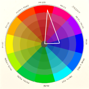
Pigment particles range in size from about 0.5 micrometer to 50 micrometers. The illustration below shows the relative size relationship to pigment particles and watercolor paper.

When paint is staining it means the pigment particles settled further down in the paper and can’t be easily wiped off. Non-staining paints have large particles that primarily settle on the surface. This is the basis of a test you can do to determine the size of a paint particle: apply the paint, let it dry, and then try to lift it.
I’m sure this seems like a lot of technical information, and what good does it do? Especially if I don’t know about the characteristics of pigments I use and I don’t feel like running tests. So, let me supply a secret to get you going. Any paint that has a chemical-sounding name will have smaller and stronger particles; it will be more staining, as well as more transparent. Most also have low density particles that will stay afloat for a longer period and provide edging. Most paint manufacturers have named the more recently-developed paints (since about 1950) with chemical-sounding names.
I like to refer to these chemical-sounding paints are the MODERN paints. They include names like Pthalocyanine, Perylene, Quinacridone, etc. So, just look at the name of the paint. If the name sounds like it could be a medicine, it will be ‘transparent’ and ‘staining’. They started appearing in mid 20th C. They are built in the lab mostly with the very sociable carbon atom. Hence their more technical name: ‘synthetic organic’.
Some other examples: Perinone, Anthroquinone, Pyrrol, Dioxazine, Isoindoline, Napthal, Benzimida, and anything with ‘azo’ in it.
What I like to call the ‘Classic Paints’ (pre-20th C) were mostly from the earth: Cobalt, Iron oxides that provided all the Ochres, Umbers, and Siennas, and Ultramarine: one of the more spectacular earth pigments. Blacks come from burning bone or oil. There are also many natural organics, which come from plants and animals – like rose madder or Indigo from woad. The pigments/dyes from organic matter are all non-lightfast, and will fade with time.
I often will refer to the Classic pigments as ‘Sinkers’, and the Moderns as ‘Floaters’. For the most part, the Classic paint pigments will have larger, more dense particles.
Note: There will be exceptions to the naming by the manufacturers. This intentional misdirection will come primarily from the Modern Paint pretending to be the Classic version. “Permanent Alizarin Crimson” is an excellent example of this. Alizarin Crimson is a fantastic multi-hued cool red/violet pigment. Unfortunately, because is it partially plant-based, light breaks it down and it eventually becomes a weak brown. The Moderns have a wonderful set of reds and red-violets and can easily match the hue of the original Alizarin Crimson (but not it’s magic). The paint manufacturers, in an effort to provide a light-proof color that matches Alizarin Crimson, create a modern version. They know that a chemical-sounding name will not be as popular as a known favorite. Rather than call it ‘Quinacridone Rose’, they might choose ‘Permanent Alizarin Crimson’. By including the word ‘permanent’ in the title, they are not technically claiming it is Alizarin Crimson. At the same time they are allaying the fears of any artist that has recently discovered that her favorite cool red turns brown after time.
Another Note:
Most of pigments in the paint you will buy will have been made in a lab. Even the Classics these days are duplicated by the pigment manufacturer. You can find a few paints that claim to be from the earth, and some of these are very nice in how they feel. A good way to dip your toe in this pool is try a few of Daniel Smiths ‘PrimaTek’ series. They do not really include any color you couldn’t make from your current palette – but the characteristics are unique.
Yet another Note: Prussian Blue, also known as Iron Blue was the first of the Modern pigments despite its name. It was the discovery of Prussian Blue that ultimately led to the Synthetic Organics and promoted Alchemists to Chemists (because they starting making the big bucks. In that age, a new color was equivalent to a new Iphone).
Practical Applications
Let’s put some of this new knowledge to practice. Suppose you want to lay down a nice blue wash. If you want this wash to be smooth and homogenous then select modern paints. The Phthalocyanine (thalo) blues are excellent for this.
If you want to see brushstrokes and granulation, or if you want to be able to do some lifting, use the Classic blue paints – Cobalt, Ultramarine, or Cerulean. You don’t have to use only the classics, as long as at least one classic is in the mix any technique that works with Classics will work. The Classic paints will dry more slowly – mostly because the pigment particles are larger and prevent the water from soaking into the paper as quickly. A Classic paint in your mix will slow drying as well as help you lift paint after it dries. The heavy/large particles sink faster, coating the paper and the finer/lighter pigment particles (Moderns) will settle on top of this coating. It is like you are adding another bit of sizing to the paper.
If you want to do something to the paint as it dries and want to maximize affects, use the Moderns. Adding water, salt, plastic wrap, stencils, etc will have more effect with the Modern paints, primarily because they create edges. The fine particles tend to be moved more easily and settle along the places where something is touching the paper. Some of the Moderns will edge more profoundly than others, so test to find the level of edging you want.
.